As you might or might not know, I do quite a lot of freelancing. The drawback of my type of freelancing is I don’t get any direct credit or allowed to talk about it.
However, today I can briefly mention a project I was part of which is about designing your own playground. For example, for a kinder garden, local park or something around those lines.
The project is still an ongoing project thought but the type of projects I am taking part in, and learning more from are not directly games for entertainment.
So you can start with a predefined design if you like similar to this image here:
Pre-Designed Sets
After clicking it you can then edit it with different props, depending on connection points and other settings that define what you can and can’t do.
Basic Set
As you click around the green dots you can choose the appropriate props to add.
Choices for the green selection dot
And you can keep adding, editing, moving them around and rotate around to view the potential masterpiece. This can then be ordered and created for real-life playgrounds.
This time I went for general inspiration and I ended up with
these two images. What you will notice is that they do not reflect the final
lighting. This is because I used the grayscale and general idea of it, rather
than copying it.
Image from the book mentioned on the image above.Photo by: Sheng-Wei Wang
Turning inspiration to BW
Turning Inspiration to Opposite Color
Setting up Basic Lighting
I then set up the basic lighting in which we want as few
light as possible to maximize the effect, range and intensity. I also wanted
the middle light to have the blue and strongest light intensity. And the outer
areas to have a orange weaker light to them.
Tweaking Shadow
I didn’t want my usual sharp shadows. I wanted them a bit
more diffused so I adjusted the source radius on all.
Key Light as Area Light
I used area light for the key light to get diffused shadow
but also a nice soft effect overall to the scene.
Reflections
I tweaked the reflections to get the desired reflection out
of the whole area, including ground. For the ground I use planar reflection.
Skylight
I didn’t want too much bright light coming in from skylight,
so I kept it to the minimum using the cubemap.
Fog
I then added some orange fog to emphasize the mood and spread
the light around a bit.
Key light Color Test
It was important to get the basic color right, intensity and
range of the key light. Which as mentioned earlier was an area light.
Camera Angle
I started tweaking the camera angle to decide the
composition, depth of field and other features.
Post Process
During all this I also tweaked the post process to pump up
the desired effect.
Light complexity
These days I like to check the light complexity to optimize
the scene a bit. This is why there are so few lights on this scene.
Lightmap Density
I also bumped up the lightmap density to get more out of the
quality, but not too high.
GPU Visualizer
And to ensure the optimization is at its best I check the
GPU Visualizer. I try my best to keep the numbers low which means the ms cost
and fps is optimized.
The first
thing I did was look for general references that could work for me. And after
that I decided to create a colour palette that I think might be interesting to
do. This scene is popular to light, so I wanted to use colours that were less
popular. For that reason, I went with teal, purple and yellow/orange.
Color Wheel
Greyscale Lighting
Grey Scale
My
preferred way of lighting is to get the greyscale the way I want it. So I focus
on where the light should come from, where is it hitting and generally ensuring
that the values from light to dark is clear.
Deciding on Color
Once I have an idea I go back and forth deciding where the color should be
for what, its intensity and range.
Lighting Color Mode
Shadows
As the process continues I start looking at the darkness and which method
to use to remove complete blackness when viewed with materials on.
Lighting With Material
Post Processing
Post Processed
For this particular scene I decided to lean on stationary light a bit, and
use post processing volume to bring out the light using exposure and global
illumination.
IES Profile
I would adjust the IES profile to get the desired effect, which meant
changing intensity and range to deal with the changes that came with using IES
profile.
IES Profile
Shadow Length/Shadow Bias
Certain
stationary lights where not giving contact shadow and it took me some time to
realize I had to adjust Contact Shadow Length. For the movable lights I
adjusted Shadow Bias.
Contact Shadow Length
Detail Lights
For the few
detail lights I prefer using movable lights, and those tend to be added to a
different lighting channel to save resources. Additionally, I will turn off
shadow if possible. This makes moveable much cheaper to use.
Moveable Lights
Window Material
To get the
desired look for the window, I changed the map and overall settings to get the
look.
Window Material
Reflection Probes
Eventually
I added reflection probes to see if I wanted to make any changes or adjustments.
Reflective Surface
Summary
Naturally
during the process I added dirt mask, bloom, colour correction and tweaked the
lights into I got it just right.
Doing game lighting compare to cinematic poses some other challenges, unless you are doing real-time cinematic that is. I am specifically talking about performance, gameplay, and clarity to name a few. In this blog post, I will break down a test lighting I did for a game jam 2D Side scroller with a sci-fi theme to it. The majority of the level was put together by my friend with some adjustment made by me later on. So let us start with the general workflow, starting with References.
References – Color and Mood
The first thing to do is always get some references, it makes it much easier to establish your mood and lighting setup. Let me provide two samples from the reference library that I used to light the area.
Star Citizen – Mood and Color SchemeHalo 4 – Mood and Color Scheme
Once I spend a few hours doing this process I try and establish my own color scheme based on my references, this ensures creative freedom, expression and artistic decisions suitable for the particular game you might do lighting for. Provided is a sample of said color scheme that was used to light up the level.
Base Color Scheme – Oversaturated in comparison to references
Light Placements
With the concept, planning and reference phase semi-completed I recommend thinking about where to put the lights, as in my case there are suggestions on light sources but in some cases none at all. So an example of how it would look like is this:
Notice no physical light sources
Looking at the environment I started playing around with different light placement but ended up placing lights somewhat like this:
Light Source Placements
The reason for these placement was to have the flexibility of creating shadow through barrels and beams. There are additional light sources behind on the yellow wall, to create light in the background. All of this together gives enough light sources to create specular, reflection, highlight, shadow and overall dark background. This is because majority of the light is around the playable area, thus the background will become darker.
By now, maybe you noticed the color of the materials. This plays an important role in what color light to pick. In this case, I was the one who changed the materials to yellow and red, to emphasize the blue/teal lighting that would go in the playable path. With minor breakups using red/orange.
I continued adding static mesh light sources down the hallway, in the process I added elevation and other details to adjust the level design. The darker red light was added to the door entrance with a big wall in between, and other light sources where given a blue teal color. I added similar light sources behind camera to ensure it wasn’t too dark on either side.
Adding the light to the level
One of the first thing that is good to do is getting a decent emissive from the materials that are on the static mesh light sources itself. This will give out a light that can be baked into the texture, saving real time resources.
Emissive lighting turned on
Then a lot of time goes into adding the best suitable type of light type, such as spotlight or point light to light up the area as intended. In this particular case a mixed method was used to create the lighting. Another mixed method was used called static, stationary and dynamic lighting. Static being the cheapest, stationary mid expensive and dynamic the most expensive. The biggest difference is that static is pre-calculated onto the texture and won’t cast shadow if something moves in between later. While Dynamic happens per second and will cast shadow if something comes in between.
All of these are using spotlight with their own range, intensity and color.All of these are point lights with their own radius to brighten up darker areas.These are detail point lights. It means they are unique in color or have a distinct purpose on creating detail lights due to their souce. In this case computer screen and devices etc.
All of these lights have unique settings to them for different purpose and reasons. I will try and explain some of the principles behind it. In general only the important lights have dynamic shadow on which means it is calculated every second while the game runs, everything else is baked to save on resources during gameplay. This allows me to be slightly free in using extra lights in areas that I need to in exchange for longer baking time/rendering.
These spotlights are one of the main light sources, known as key light. That is why their intensity is brighter to show the clear path of direction for the player. The two cones evens out the intensity and gentle fades out the hotspots. This is also a dynamic light and cast real time shadow during gameplay.The second main light source is also a spot light with a wide range to cast shadow far enough as the player moves. It’s color however is on the opposite color wheel which is red. This was to breakup the monotone color scheme. Notice the light on the top wall is same type, but set to static as it doesn’t need to be dynamic real time. Optimisation and illusion is key.These points lights all have different range, intensity and color but their purpose is to fill in darker areas and spread out the original light source by faking it. Because of this their shadow is turned off some places to reduce render/baking time and set to stationary to avoid real time cost. The yellow radius is radius representing light source size, in this case faking the fluroscent light source in the gateway everywhere. It affects the ground also.Notice the ground. This is manipulated through the source radius settings mentioned above.
As shown so far there are many things, thoughts and techniques used to prepare the lighting of the level. From this part on I copy pasted the lights to the rest of the level. That is why color palette, lighting position and most of the work is done early so rest of the level would go quicker. However, since each section is different some tweaks are still required.
An example of such a scenario would be the image shown later below which has hotspot created due the static mesh being closer than other objects earlier when creating the lighting setting. These lights also have something called IES Profile which is physically accurate light patterns from real life. To save time I took an image from Atul Dravid.
The lights being used for the game level is also using Inverse Square Law which is basically how lights fall off and lose’s intensity over distance as shown above. But I took another image to save time, this time from Johannes Daunner to show a quick example.
This is when we can turn off the Inverse Square Law and play around with intensity, range and light falloff exponent. In my case I also adjusted the point light to add intensity to the floor to closer match the other areas.
Notice the details of the mataerials and objects are easier to spot, such as the white line on top of the machine which would otherwise be hidden.
Basically you keep going like this looking at your reference, color palette and adjusting it based on values, contrast and what you are going for. I tried making sure the background was visible enough while the main path was brightest. Smallest thoughts went into it such as purposely having white tiles on the path and black on both sides of it, this creates contrast and also ensure brightest spots are in the middle of the path.
Fog
I won’t go too much into detail but when you add fog into the scene such as Exponential Height Fog you need to remember it creates flatness due to the type of technology it is. Some time was spent to push the fog to the middle of the scene rather than the whole scene, this was to ensure depth without losing value and contrast. Additionally fog sheet was used to put around on the side background to create further depth and mood. The light sources closer to the player area and higher up was given volumetric lighting as well.
The distant fog was kept to this area while the volumetric fog light was kept closer and up in the air. This was to create further depth to the scene, which often can go wrong and make it more flat.
Post Processing
Eventually I wanted a more worn down color saturation, in other words desaturated color scheme. For this the Post Processing Volume was used by adjusting tone mapping, chromatic Abberation, Bloom, Ambient Occlusion and custom LUT was created in Photoshop. A LUT is basically color correction.
Post Processing allows us to adjust the mood, contrast and ambient occlusion to our intended mood and feeling.
Final Touches
For the final touches you keep iterating upon color, intensity, value and depth. You add in some more details and reflections. You go into Light Mass Settings to adjust the light baking quality, you pump it all up to max and you look for compositional shots to promote your work.
I hope you learned something. Feel free to share, like or contact me. Easiest method is to contact me on linkedin or artstation.
When doing lighting it is important to understand what makes a diffuse light. In other words, knowing the difference between hard light and soft light is essential.
Hard light
What makes hard light different from soft light?
Typically the shadow is very clear, not very soft or diffuse.
It is clear where the light source is coming from.
Hard light tend to bring out all the details. Therefore you often see diffuse lights being used to soften up portrait images.
We often use hard light to bring mood and then use softer lights to brighten up the dramatic mood if needed.
Image by James Wheeler
Image by Ketan Kumawat
In real life and digital context, the type of lights that can produce hard lights are following:
Point light
Sun light
Spotlight far away
Area light far away (Commonly more used to soften scenes though)
What is important to keep in mind is that it is the scattering rays that defines what is hard or soft light. That means if the light rays have equal distance and they are parallel to each other, they will most likely create harsh shadows.
Original Image by Pixabay.
Soft Light
What makes soft light different from hard light?
Soft light is the opposite of hard light. It can reach the point where the shadow itself is very bright and becomes very blurry. When that happens it is hard to separate the shadow from that actual bright area, that has no shadow.
Generally the soft light comes from more than one area, often the sky or light bouncing off a surface. Therefore shadow in most context, is never completely black. This is because some light is coming from somewhere, that is diffuse light and fills in those areas.
Portrait pictures, often of woman tend to use soft light. It avoids hard shadow and hides detail from the face. Personally, I don’t like soft light too much as it creates a flat image and from a creative point of view, it becomes boring to me. Generally, it is safe to use soft light for calm and pleasing feelings.
Image by Daniel Spase
Image by Bruno Cervera
In a real life and digital context typically you can create soft light effect by following methods:
Photographer soft box or transparent image plane in front of the light source.
Light passing through clouds, cloth or otherwise.
Generally large light sources can create diffuse light.
Light passing through something.
Light reflecting from a surface such as bounce light.
Area light is a big favourite for many when creating soft light digitally.
Sky light in the software such as skybox etc
Ambient light settings in digital software
Emissive texture/material
In contrast to hard light, diffuse light have scattered light that goes everywhere.
Original image by Nout Gouns.
I hope this article was useful, best of luck with your work.
I thought it was time for a small update on something. Some minor progress has been made for the workshop project, in which I have designed initial layout of what might be the first levels of the prototype project. Below are some images I can share.
[Above] This is basically a type of timeline which uses traditional narrative to plan and structure the overall prototype. It shows in brown what main things might happen, such as teaching basic movement, aiming fun, advanced movement, introducing obstacles, getting shotgun, fighting mini boss, getting explosive and fighting main boss. As these events occurs the time line shows intensity/drama and its pacing. Pacing being calm versus stress. You may notice that during some sort of hazard puzzle or fight, it takes a higher peak.
In red, it shows what surroundings will be filled with, so for example during aim gun there will be enemies, and during adv movement there will be security, lock, camera and turret to deal with. And during obstacle that are hazard, it will be based on electricity, fire and steam. The mini boss will be armored unit, the grenades are meant to deal with range enemy, and the boss will be armored car which suggest that the recent explosives might assist in defeating the boss.
[Above] The image shows the general level design from a holistic point of view, not details. So it shows how the player learns jumping, meeting enemies, learning to navigate stairs, box and ladders, jumping larger gaps, break through window, run and gun interior and so on. That was ACT 1. For ACT 2 you will see the obstacle in the sewer, showing a water with electricity, fire from broken pipes, a repair station with enemies and elevators, hot steam events and elevator taking the player back up to surface. For ACT 3, you see a car park, run and gun mechanic, grenades, timed event, range enemies and boss fight pattern. On the far right side of the image, you can see what each area introduces.
[Above] Eventually I like to draw some thumbnail sketches showing more visual mechanics that I have introduced in the time line, it helps the brain to think, plan and consider some weaknesses.
It is a slow progress with our Workshop due to other commitment. But in this post, I will explain some of the early tests, adjustment and changes that we have done during my meeting with Nachi and myself. And then the basic block out I started doing for level design.
Adjusting the jump settings
One of the first thing we reacted on was the floating feeling of the jumping. So, we decided to figure out how to fix this. We basically adjusted individually settings and slowly we figured out a setting that worked. We didn’t know what every setting did and Himanshu ensured we had access to Gravity Scale this time around which was essential to tweaking the jumping. Eventually we figured out that Braking Deceleration Falling was the setting that gave the falling a more rapid speed.
Adjusting the Metric
Because we changed the jumping setting it affected the overall height and length. This meant we needed to adjust the test platforms and decide the minimum and maximum metrics for single jump, double jump and high + long jumps. To do this we added bigger objects and saw if we could jump over it, and if we could jump over it from higher elevation and so on.
Registration of the Metric
To ensure we got accurate numbers we went into side view and used the measurement tool to measure height, length and other details.
As we continued we made changes on the go. For example the height of the highest platform for double jump standing still.
And then later we changed the gap of the platforms the player can jump from.
After we finished these metrics we talked a bit about Supergrid which the plugin is we are using to do rapid level design. I won’t go into it here. But I will end with a video showing some of the early level design I did, I might explain by making a video next time. So be sure to subscribe to my youtube channel for those type of content.
Last year I assisted in producing a short movie called Poker Night: A Dark Comedy by Omegastar Productions and my own freelance studio which also does production. During development and production I also did Photography and helped with Lighting. Now, this was a zero budget so we mainly dependent on contacts and resources we could borrow. Our location was rather small so we had a few challenges to deal with to create the setting we wanted. As seen in the images below this is what we had to work with.
We decided not to use the room natural light and installed a hanging light source of our own from the roof in the middle of the room. We did have to try different light bulbs to get the desired range, intensity and color we wanted.
Another challenge was considering that the room needed to be bigger than it looked, and considering camera angles such as the kitchen on the other side. In other words, that kitchen needed to disappear. So a magic trick was required.
What could we do? We knew white bounces the light around and makes everything more visible, as shown in the image above with the light coming from the roof. So we spent sometime and put up black blankets to stop the light from spreading, and make it easier to create the room to become bigger. Also, I was the Boomer and On set sound guy a few times as well in the middle of everything. As the image below shows, there is no kitchen anymore.
We did try LED lights, Soft Boxes and such but due to the size of the room we needed to solve our lighting in this way. As such the image below shows how it ended up looking. The room feels bigger now and yes the last thing we did was add tape around the lamp to make the light softer towards the walls, to stop it from creating harsh light and shadow.
With that out of the way we did some photoshoot for behind the scenes, posters and more.
For this we used two LED lights and one soft box to lit up the cast. The LED lights was mainly to fix some background crease and issues, while the soft box was to soften them up. We also kept the room main light on to get a general even bounce. After the cast left I took photo of the Dealer and the gentle girl with a very different lighting setting and condition, within the same room.
The idea above was to see the highlights of the mask, well enough to know it was the dealer and half of the face of the “victim” as the main facial subject as the eyes goes back and forth. Of course, the emotion of fear is the intended focus here.
Here the idea is to keep 70% of the mask visible in burned out golden light, and one of the eyes slightly visible in the dark. Keeping the contrast between light and dark. The focal point being left side but still giving the viewer ability to look at right side. Making the most obscure part the eyes. These images were then prepared by the director himself, into posters such as the one below. Due to the high contrast it made it easier to stylized the posters.
I hope that was a fun and useful read. Feel free to follow Omegastar Productions at following places:
One of the side projects I have going right now is a Side Scroller inspired by Duke Nukem Manhatten Project. I am helping out with is designing and lighting up the game. The idea is going trough concept phase right now, and we have given ourselves 60 days to complete the project, due to other commitments all of us have the first 30 days of August. The purpose is to learn together with a group of other people, looking to improve their skills.
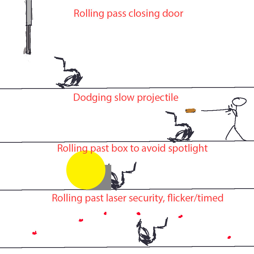
So far I am brainstorming and pitching some mechanics which are poorly sketched, here are some examples.
As you can see there are some core feedback loop going on using movement mechanics, and additionally I have suggested the use of a Speed Injection, which is meant to slow the players time, to make it easier to tackle more complex scenarios featuring more of above obstacles and challenges.
Of course, this is all very early stages and people might drop out, including me, for various of reasons but I thought I would give it a try.
Besides that we have set up a preforce using amazon services and connected it directly in to Unreal Engine, which is what we will be using for this particular project.
Stick around for future updates regarding this project.
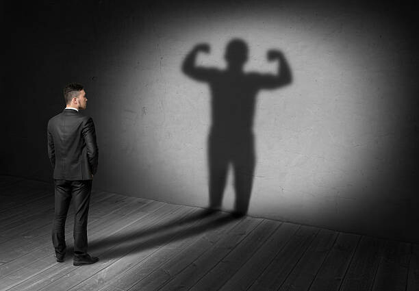
When working in lighting and using shadow it is a good idea to understand that all shadow are not the same. Depending on environment, light source and other light sources the shadow is different. You can in our case, digitally, be creative and have shadow tell a story. So did you ever look at a reference image and tried replicating the lighting, but for some reason something was off, maybe the shadows? This should help you to analyze and pick the right solution.
Cast Shadow
Cast Shadow are shadow created when light hits a form, and the form is next to surface that can cast the shadow.
Contact Shadow
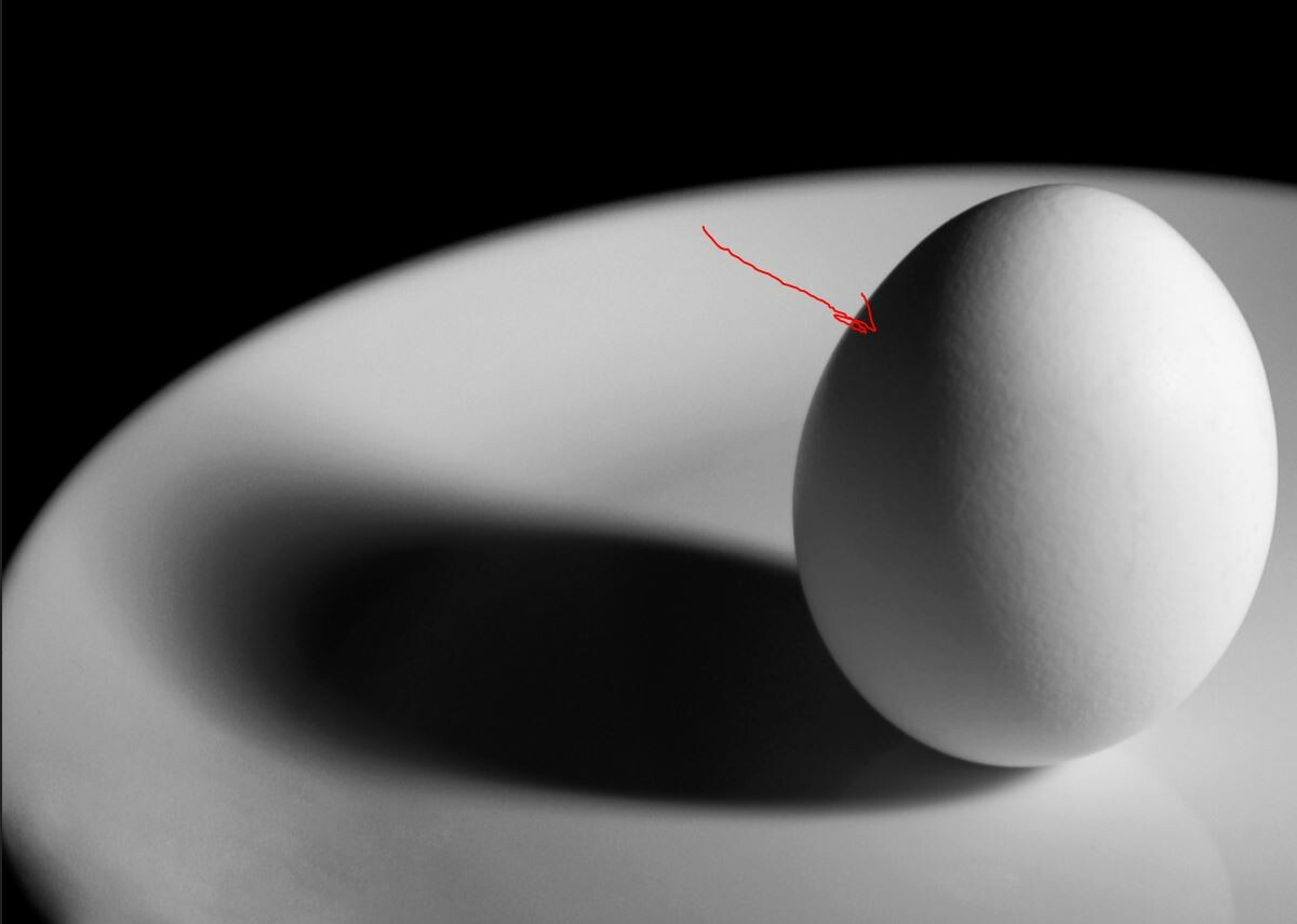
This shadow is created is often the blurry shadow right beneath the object itself, it is how you know that an object is in contact with a surface.
Shadow Side
This side represents the darker side of an object. In lighting, all these shadows often receive fake lighting to make it more unique and realistic.
It is important to understand that shadow isn’t black and mostly receives some color or source of light. That is why we will add fill lights to it, to get the desired effect. So even though logically you might place out one light source, you should be doing more than that.
Shadow Size
Understanding shadow size is important as it allows you to understand what type of light, where to put it, which angle and distant to use. The most important thing to keep in mind is the angle of the light source. If the light is coming from above, the shadow is going to be very small. If the light is coming from further down, the shadow stretches out.
Another thing that factors in shadow size is the size of the light itself. A good rule is if the light source is smaller than the object, then the shadow is larger than the object. If the light source is bigger than the object, then the shadow is smaller. The reason for that is because if the light source is bigger, it casts more light and wraps around the object thus reducing the shadow size.
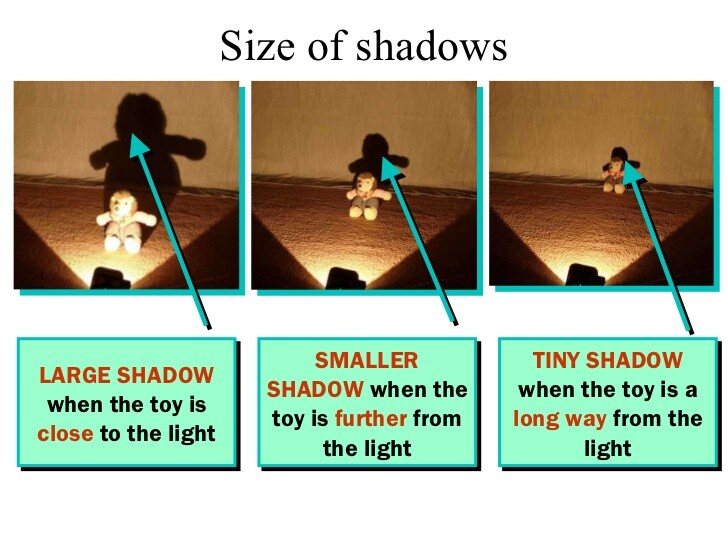
Lastly, the distance of the light will also affect the shadow size. This one however has a secondary thing to keep in mind as shown in the image above with the bear. The distance of the object receiving light and the surface casting the shadow also affects the size of the shadow.
So that is the basic you need to understand when lighting up your scenes in 3DS Max, Maya, Unreal, Unity or whatever really when looking at reference images.
That is it! Be sure to look at my previous blog or stop by my youtube channel.
 Pre-Designed Sets
 Basic Set
 Choices for the green selection dot
 Rotated view after adding a few things.